Redesigning your current business website is simple with a few easy steps. Don’t wait until next quarter, get started today to connect your business with more potential clients with fresh and engaging website content strategy.
1. Highlighting Your Most Important Information
Like building a house, updating your website relies on a solid foundation to make it a success. A good rule of thumb is: When in Doubt, Work from the Inside Out. There is no use in having HD photos or flashy animation on your site if visitors can’t easily read the information or, worse, cannot find your important information. It has been shown that the home/index and contact pages are the most viewed on any given website. Make the most of that valuable real estate through answering The Five W’s and the H:
- Who
- What
- When
- Where
- Why
- How
Begin answering these questions by providing this information on your home and contact pages. Your visitors should be able to glean this information at a glance from your homepage without having to scroll. Think of your homepage like the front page of a newspaper, the most important information is “above the fold” while less important information can be included further down the page.
View an example of our latest work, DistinctParadigm.com:

Previous design with a hero image but no information included.

Redesigned with the phone number, short description, and a Contact Us button above the fold.
2. Less is More
Less color. Less text. Less “stuff” on your webpage can actually make it look like there’s more content and, in most, cases more professional. You or your marketing staff don’t have to get bogged down into details and semantics when light text and semiotics can be more effective.

The white text on detailed, colorful backgrounds makes this section hard to read at a glance.

Title, contact information, and a clear image makes the page more scannable.
3. Create Hierarchy with a Simple Color Scheme
If steps one and two are the foundation, then this step is the wallpaper. Color is a great tool to add hierarchy to your site so your visitor can see what’s important, fast. The colors you use for your footer, navigation, or buttons can tie-in to your logo or complement it by choosing a color on the opposite end of the color wheel.
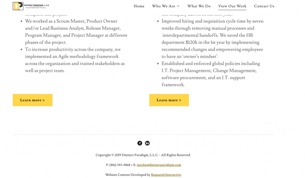
Bright yellow for the buttons calls your visitor to action by contrasting the button against the rest of the page.
4. Include Clear CTAs Where You Can
Great copy does not a wonderful website make. Having clear calls-to-action (CTAs) is key to making your website easy to navigate. This ties-in to step one where a clear CTA can be included in a button under your company’s tagline on your homepage. Including these buttons under paragraphs of text can give your visitor an easy transition to the next page without having to think to scroll back to the top nav.

Yellow buttons provide simple CTA for your visitor.

5. Optimize Your Copy with Keywords
So you have clean text, a professional color scheme, and clear CTAs but no visitors? Generate more traction to your business website through targeted keywords in your copy. Incorporating keywords into your copy could help your website rank higher in search results, this is called SEO (search engine optimization). Search engines like Google scan through your site to ensure that your keywords are appearing in your actual site copy and not just in your metadata. This advancement prevents “keyword stuffing” so visitors who click on your site will actually see the information for which they are searching.
Generally, keywords can include your location or the location that you serve, your name, your title, and your organization. You can also get more specific with your keywords to include industry terms, companies you’ve partnered with, and much more. There are no set rules in determining what a keyword is. A keyword is whatever word your visitors may be using to search with to find the services or products your business provides.
Thank you for reading! Be sure to bookmark this page to stay updated with our latest posts covering topics such as social media strategy, analytics reporting, and more.
